5.3 Example 3
1 Introduction
Vipunen contains statistical data on Finland's education system. Data
is organised by subject fields and sectors and published in several different reports and report views.
The editing functions in your browser include filtering,
sorting and cross-classification of data using the available variables in the report (see Chapters 3 and 4 of this guide). You can also download data to
spreadsheets on your computer for further use (see section 3.5).
For three examples of how Vipunen can be used, see the end of the guide (Chapter 5).
2 Finding a report
Reports are grouped into eight main categories (the website's top menu). Each main category contains a more detailed classification according to the report's subject (the menu on the left).
Vipunen has three types of reports: standard reports, analysis reports and downloadable data files. Standard reports contain fewer variables, and they can be opened from several different view points. In contrast, the analysis reports contain more variables. They are designed for more in-depth use of the service.
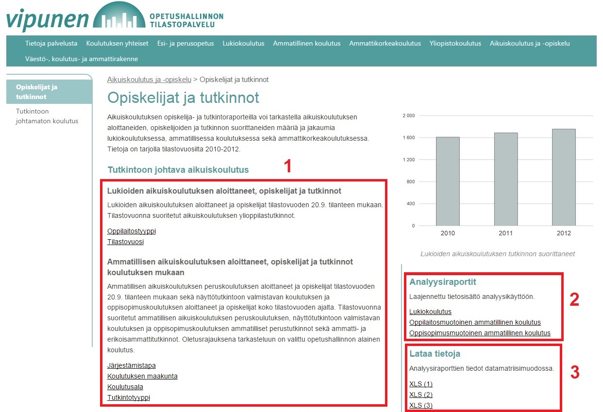
1) Standard reports
2) Analysis reports
3) Downloadable data files
3 Basic use of reports
3.1 The opening window
When you open the report, you can see a green menu on the left side of the browser window. The menu includes options for filtering, printing, and downloading the report’s data. On the right side of the screen, you can see four tabs: the table, “Graph”, “Information”, and “Instructions”. The Instructions tab provides a link to the descriptions of the variables that are available in the report, and it contains some instructions on how to use the browser reporting program. The Information tab provides information on the report’s data and on the filters used (it updates automatically based on the user's filter selections).
The menus on both sides of the screen can be hidden. To modify the contents of the table, use the Pivot button on the right side of the screen (see the picture below).
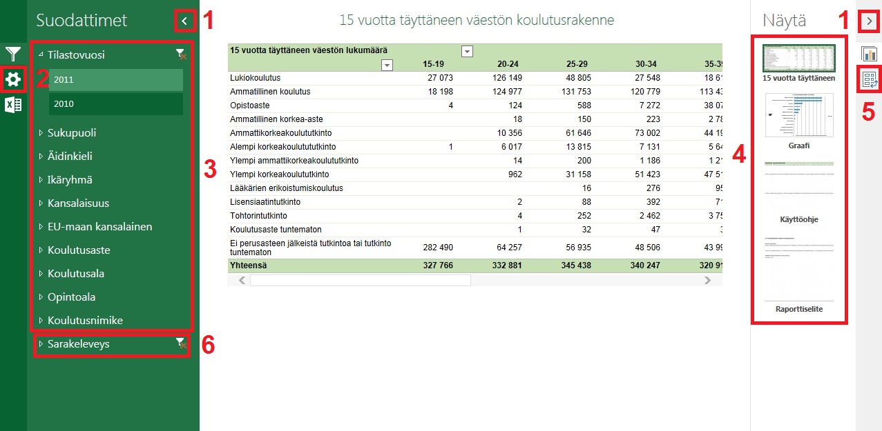
1) Hiding the menus
2) Options menu (use this to print the report)
3) Filters (to filter the report contents, select variables in the variable menus)
4) Tabs (Table, Graph, Information, Instructions)
5) Pivot feature (use this to modify the table and graph contents)
6) Adjusting the table column width
3.2 Reading the table and the graph
The table and the graph are generated based on some preselected measure or measures (for example, 'Students', 'New students' or 'Qualifications'). The name of the measure is shown in the top left corner of the table or in the column headings (in the case of several measures, in the column headings, otherwise in the top left corner). In the graph, the measure name is shown in the heading.
Data in the table can be organized by row and column variables. In the opening window, a preselected variable is shown on the rows (for example, 'Field of education'). Typically, it is further divided into columns (for example, by 'Type of education'). To check the variable names, use the downward arrows located above the rows and columns (click on the arrow with the left mouse button).
To drill down to more detailed levels on the table rows, click the + sign next to the row label. The lower row levels contain more data organized by the upper row variables (for example, ’Statistical year 2010' -> 'University data for the year 2010').
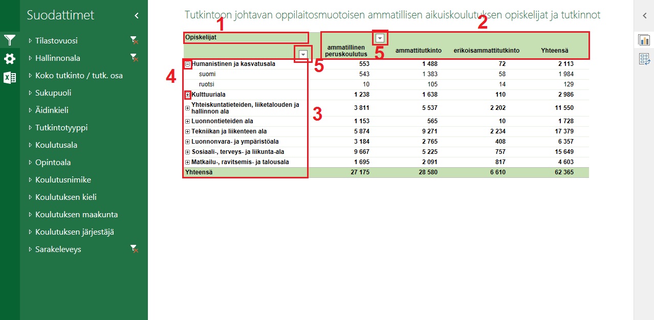
1) Measures
2) Column variables
3) Row variables
4) Drilling buttons
5) The table row and column variable names (also the menus for more sorting and filtering options)
3.3 Filtering data in the table and the graph
You can filter the table and the graph with various selections (for example, by field of education, by statistical year, by educational institution, etc.). To filter the data, use the filter menus on the left side of the screen. To apply filters, open a variable menu (for example, 'Statistical year') and click on one or more of the options (for example, '2010'). After your selection, the table and the graph show only data that corresponds to your selection (for example, only data for the statistical year 2010). You can select several fields at the same time by using the Shift and Ctrl keys (hold down Shift or Ctrl and use the left mouse button).
You can filter the report with as many variables and selections as you need. Notice that all selections are connected to each other. For example, if you select 'humanities and education' in the 'Field of education' filter menu, the 'Subfield of education' filter menu shows only the subfields under ‘humanities and education’. The selections filter the data simultaneously in the table and the graph.
(Note! You can always check your selections from the Information tab, which is updated in real time.)
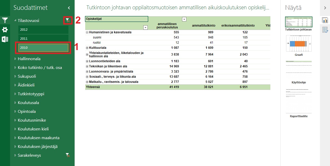
1) Filter selection (statistical year 2010 is selected in the image - data for 2010 is shown in the table)
2) Removing filter selections
3.4 Report information
You can find more information about the report in the Information tab. It provides a basic description of the report’s data and shows the measures that are in use in the table and the graph. Filter selections are recorded automatically and shown at the bottom of the tab.
(Note! The Information tab shows a maximum of 100 filter selections per variable. Approximately 10-15 variables with selections can be shown simultaneously.)
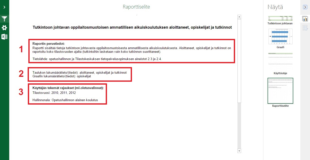
1) Basic information
2) Selected measures
3) Filters
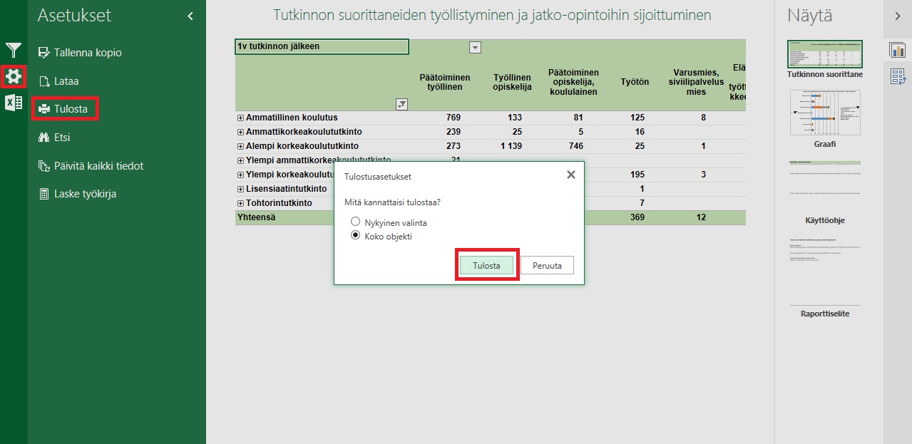
3.5 Printing the report and further use of data
You can print out the table, the graph, the instructions, and the report information by using the menu on the left side of the screen: open the tab you want to print, click on 'Options', and then select 'Print'.
To download the report to your computer, go to 'Options', and click 'Download'. The file (incl. the table, the graph, the report information, and the instructions) is downloaded based on the filter selections and other possible modifications you have made with the browser reporting program.
You can also copy data by highlighting sections of the report with the left mouse button and then copying the selected area by pressing Ctrl + C. To paste the selected area onto your own spreadsheet table, press Ctrl + V. You can highlight and copy any part of the report: the table, the graph, the report information, or the instructions.
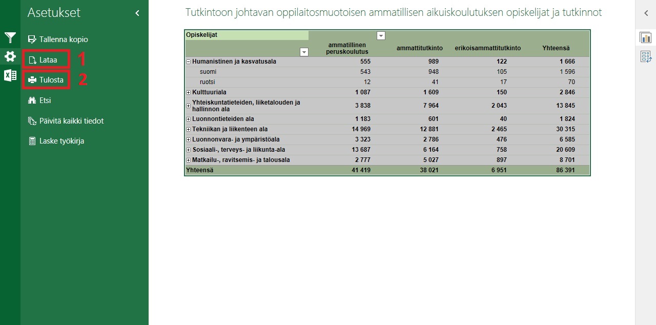
1) Printing (the table has been highlighted for copying in the picture)
4 Modifying the report
In all reports, the table and the graph contain some preselected variables that display some information about the report’s data (for example, 'Field of education' on the rows, 'Type of education' in the columns, and 'Students' selected as a measure). However, you can use the Pivot feature to change any or all of these variables (including their position in the table and the graph). By using the Pivot feature, you can create your own tables and graphs from the report’s data. The Pivot feature is located on the right side of the screen, next to the tab icons. The table and the graph have their own Pivot features, which are not connected (however, notice that the filter selections in the filter menus do affect both the table and the graph simultaneously).
A list of the variables that can be placed in the table and the graph is shown at the top of the Pivot screen. The variables are grouped based on their subject. For example, the ‘Person variables’ folder contains variables related to individuals, such as 'Gender' and 'Mother tongue', and the 'Education variables' folder contains variables related to education, such as 'Level of education' and 'Subfield of education'. The variables are typically the same as the filter variables that are shown on the left side of the screen.
The variables are placed in the fourfold area located at the bottom of the Pivot screen. Variables placed in the Rows field are shown on the table rows and variables placed in the Columns field are shown in the table columns. Measures that define the data in the table are placed in the Values field. The same principle applies to the graph.
The order of the variables in the Rows, Columns and Values fields determines their hierarchy in the table and the graph. The top variables will be shown on the top level, while the lower variables will be placed at the lower drilling levels.
To place variables anywhere in the fields, drag them down from the list above by using the left mouse button.
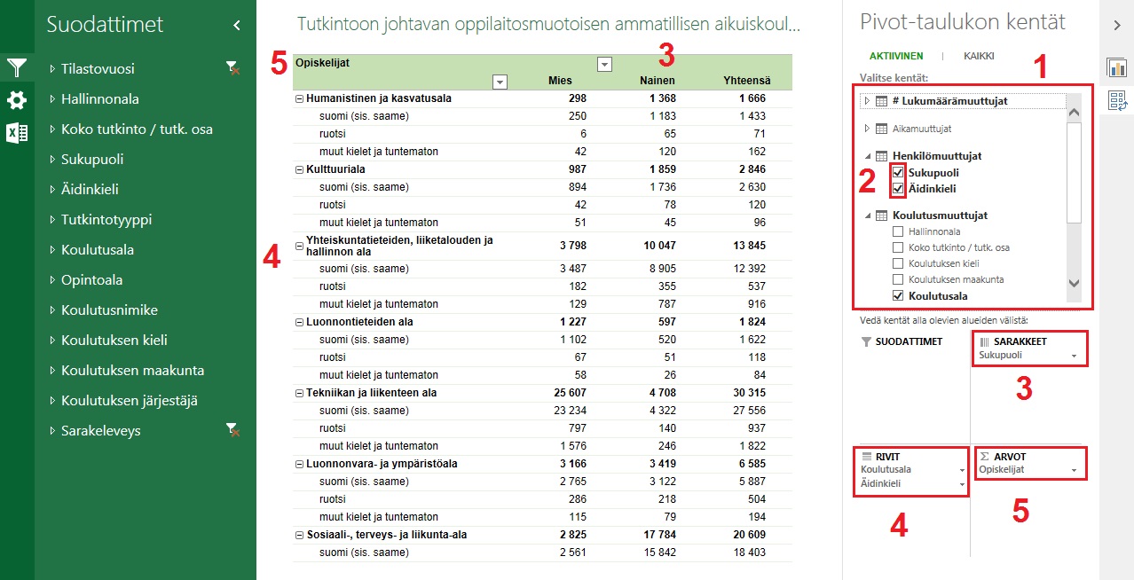
1) Variable list in the Pivot feature (use this list to select variables for the table and the graph)
2) Check boxes (when you tick the box, a variable is sent to the rows, or to the values in the case of measures; you can also select variables by dragging them to fields 3, 4 or 5 below)
3) Selected column variables
4) Selected row variables (note the drilling hierarchy 'field of education' > 'mother tongue')
5) Selected measures
4.1 Additional filtering and sorting features
You can also apply more specific rules to filter and sort the report’s data, such as 'only show data fields whose count exceeds the value 200', or ‘sort by value, smallest to largest’. These options are located behind the arrow menus on the table and the graph and in the variable list in the Pivot feature (left-click the little arrow next to the variable name).
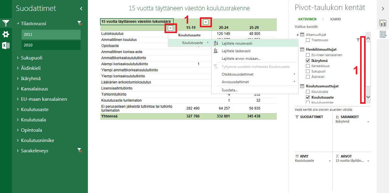
1) Additional filtering and sorting features
5 Examples
5.1 Example 1
Task: search for the employment data for all levels of education for the "humanities and education" field of education in the statistical year 2012 and print out the report.
Select 'Combined data'. Open the report 'Entry into employment and placement into further education'.
Select 2012 as the statistical year.
Select 'Humanities and education' as the field of education. The table only shows data for humanities and education in 2012.
Print out the report.
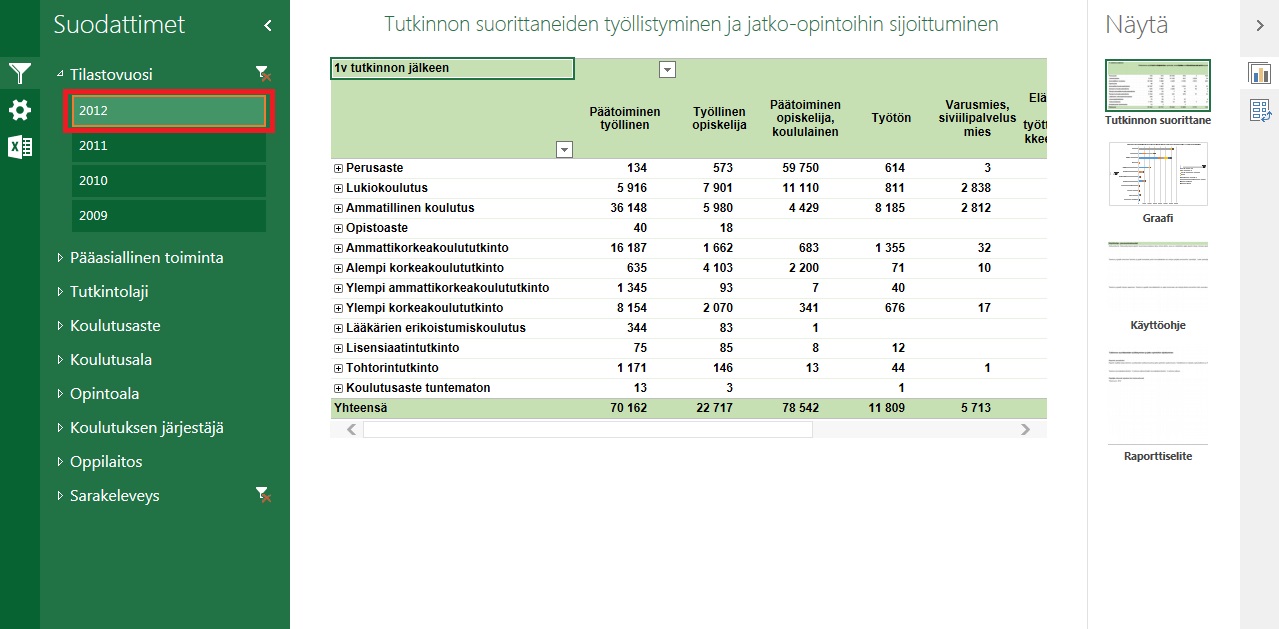
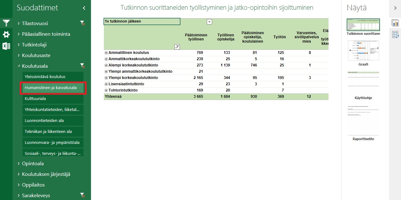
5.2 Example 2
Task: search for the number of students in apprenticeship-based vocational adult education and training by gender in the statistical year 2012 by method of education and the qualification type.
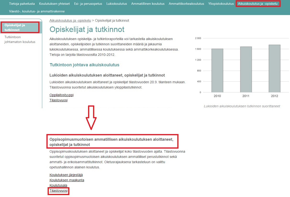
Select 'Adult education and training'. Open the report 'Apprenticeship training > Statistical year'.
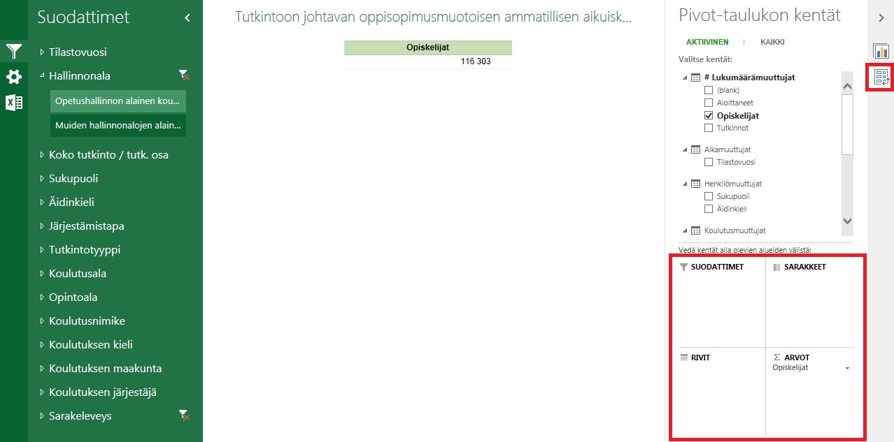
Use the Pivot feature to remove the default variables from the table (only leave 'Students' as the measure in Values field).
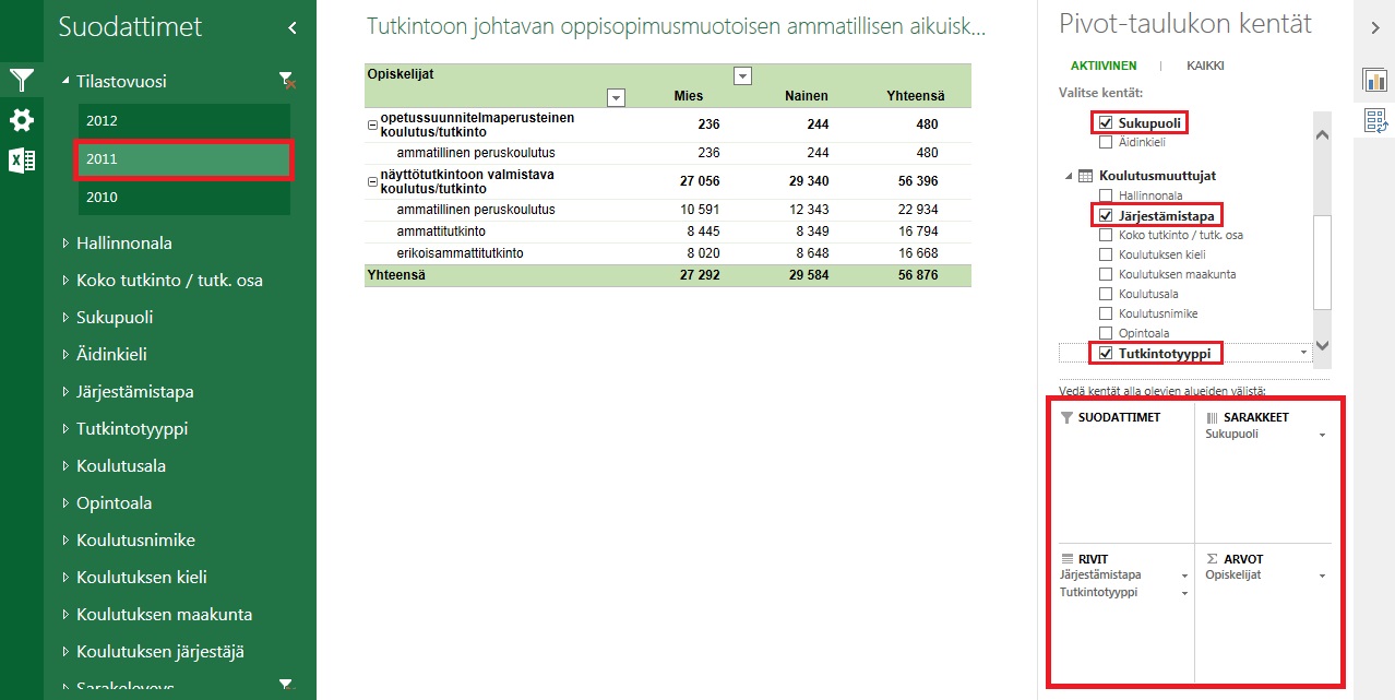
Add 'Gender' to the column field and 'Method of education' and 'Qualification type' in the row field. Filter the statistical year to 2011.
5.3 Example 3
Task: examine employment data by the level of education among higher education graduates in the region where the degree was attained. Move the table to your own Excel sheet.
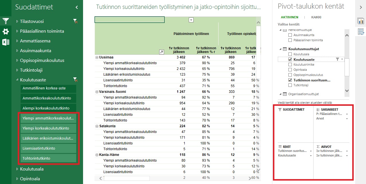
Generate a table using the Pivot feature. Select employment data for the table, both as measures and percentages. Filter the level of education to include only higher education.
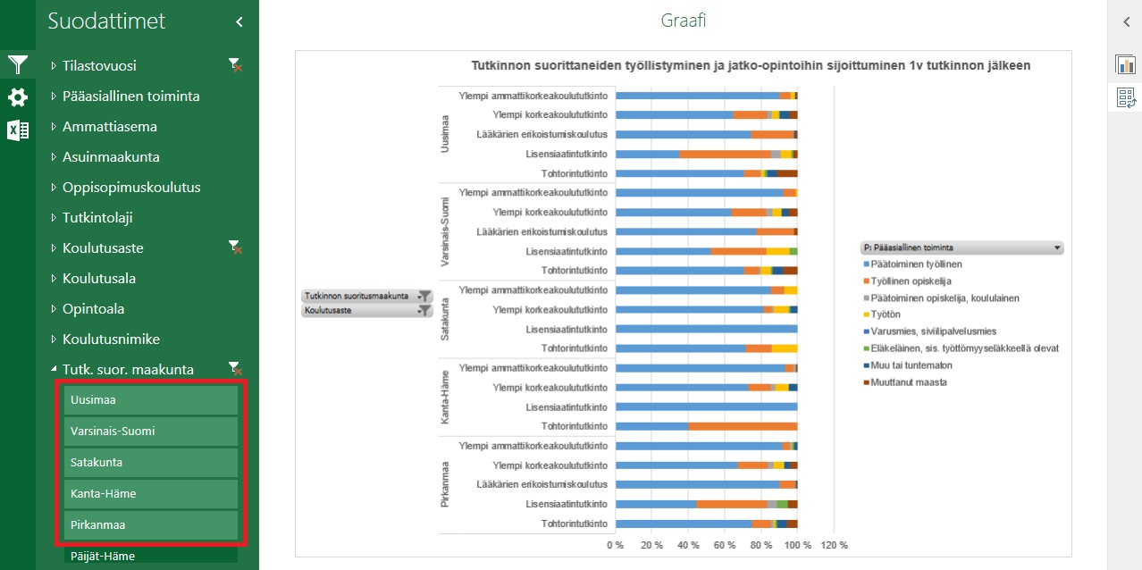
Examine the situation in the regions by using percentages in the graph. Filter the number of regions to the appropriate amount.
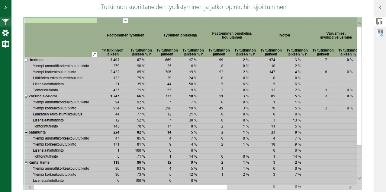
Highlight the entire table. Copy to Excel: Ctrl + C and Ctrl + V.